Thứ Tư, 22 tháng 10, 2014

Which trend for conversion optimization?

Customers are always the center of any business. So the need of understanding them are getting more and more important. The main issue is that customers are changing the way they communicate with company and the way they interact with each others affects your business. Let's see what is going on in the business world and which trend of conversion optimization is. Then you can think about raising your revenue and profit.

The Pros and Pitfalls of One-Touch Access

Amazon revolutionized e-commerce with its patented “1 Click Checkout”. Now the process has become even more streamlined thanks to mobile devices. The Amazon Mobile Payments Service takes “1 click shopping” to the next level by letting users swipe to complete a purchase. Not to be outdone, Apple has also invited third party developers to take advantage of its TouchID service, a similar mobile checkout option.
1touch
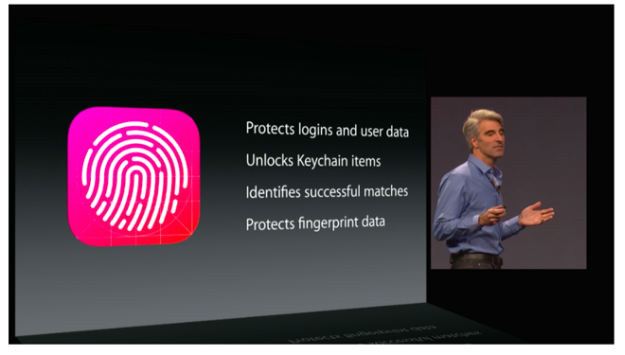
What’s more, PayPal has also leapt into the fray, touting that mobile payments alone grew over 92% from 2012 to 2014. PayPal also partnered with Samsung to introduce biometric payments on their highly popular Galaxy S5 phone. But before you rush out and start swiping, you should know that it wasn’t long before the biometric scanner was successfully hacked.
Of course, needing to obtain one’s fingerprint (as well as know which finger they predominantly use to swipe) is still an issue, but expect to see more joint partnerships crop up between payment processors, app developers and mobile hardware manufacturers as ease-of-use shopping becomes more mainstream.

Mobile is No Longer a Minority

It used to be that sites were designed with “mobile friendly” options, much in the same way that browser redirects were used to accommodate users in the early 2000’s. Then came responsive design and “mobile first” champions, which provided a truly optimized experience for users – until they reached the checkout. Then, thanks in part to clunky, “bolt-on” e-commerce systems, they were generally funneled to their respective desktop-only versions, only to abandon their cart out of sheer frustration.
And that’s exactly what happened for the University of Oregon Duck Store. Through a partnership with Volusion, it added mobile optimized commerce, which immediately saw orders rise for the subsequent six weeks. The Duck Store had already optimized its product and category pages for smaller screens, but not its checkout process.
oregon duck
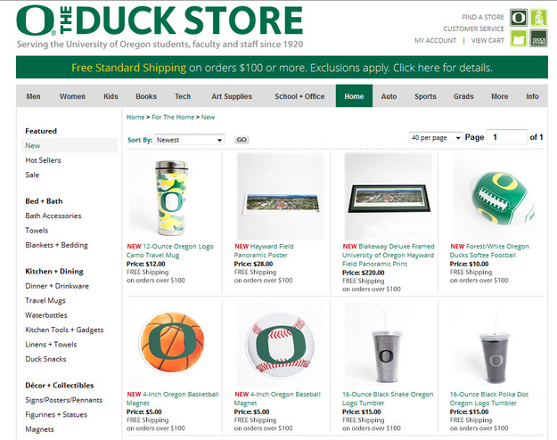
By renovating its ecommerce strategy to focus on the growing mobile market(which is getting close to 50% of traffic saturation), the Duck Store was able to increase its conversions and mobile sales by a whopping 184%.As more mobile retailers begin to optimize their mobile commerce offerings for the full suite of pages, and not just products or categories, mobile commerce will continue to grow by leaps and bounds, likely taking over conventional desktop e-commerce shopping in the coming years.

Even Responsive Design Can’t Save You, Says Study

Mobile responsive design has been heralded as the ultimate solution to end all your mobile conversion woes. Even we here at KISSmetrics embrace and encourage the use of mobile responsive design. But a new joint study from Internet Retailer and Keynote shows that mobile responsive design alone isn’t everything it claims to be.
For example, according to the Aberdeen Group, Inc., a one-second delay translates to a 7% loss in conversions. Following Internet Retailer’s example, if a mobile commerce merchant makes $100,000 a day from their site, that ends up being $2.5 million dollars lost. Not surprisingly, online retailers are clamoring for mobile optimization, and in their rush to deliver, developers are taking shortcuts.
The fact is, consumers expect to see and use a site that is a seamless transition from desktop to mobile, when, despite advances in mobile design, the foundation just isn’t there. In the study, responsive sites loaded quickly on desktops – an average of 3.15 seconds, and 2.80 seconds on tablets. But when it came to smartphones, the wait was an average of 18.24 seconds (using 3G and 4G connections).
In trying to deliver quickly, the article reveals that developers will often cut off parts of a site that they believe are contributing to heavy load times. But looking back at the consumers’ expectation of a seamless experience transitioning from desktop to smartphone serves only to end in frustration. That’s not to mention the introduction of key pieces of technology, such as CSS3, that are relatively new, so finding knowledgeable developers who can leverage this component to its fullest is still a challenge.
And although there’s no concrete formula for always delivering a prime, optimized experience that loads equally fast for everyone, you can’t fault developers for trying. Case in point – Yottaa, whose mobile engagement tweaks considerably cut down load time for their customers.
yottaa
With nearly a dozen case studies, and clients like Bayer and H&R Block, Yottaa is defining the building blocks that make mobile responsive sites load fast – even on smartphones. For example, they suggest:
  • Prioritizing elements on a page so that important pieces load first. This also involves breaking up an HTML file into smaller chunks, and sequencing what shows, when.
  • Loading images based on the profile of the device requesting them – higher resolution images for desktops and tablets, smaller resolutions for faster loading on smartphones.
  • Splitting a site off as a “smartphone only” version, rather than lumping it together with desktop and tablet responsive sites.

Chủ Nhật, 21 tháng 9, 2014

How to enhance your checkout process in order to convert more customers

Why do your customer add products to their shopping card and then leave it? How to make them complete their purchas seems to be the most popular question for any businesses. Probably you are making a lot of mistake when designing your checkout process. Here are solutions which will improve your converstion rate.
Try our product: Magento One Page Checkout

Ask for as Much Information as You Need…

…but not a single field more. A customer’s sense of dread increases dramatically with every field you add to a form on a page. For some, it’s just a matter of the time it takes to type in all their information; for others, their worry about identity theft and fraud grows with each piece of information they need to provide. Even if your shopping cart software has a default field, you likely don’t need to use it. For example, if you don’t use a customer’s fax number for anything, why ask for it? Most e-commerce communications are handled by email and phone, not fax, so many companies can omit this field. If you only ship within your own country, don’t ask customers to choose a country. Simply put a small statement at the bottom that reminds people of your policy, instead of a dropdown with a single country in it. (Or even worse, a dropdown filled with countries that generate an error when the form is submitted!)

Provide “Breadcrumbs”

Many shopping carts don’t provide a single Magento checkout page, and the jury is still out on whether they are more user-friendly than checkout processes that span multiple pages. If your checkout process includes more than one page, make it simpler by reminding your customer where they are in the overall process with a clear graphic. Think of it as the sign near the entrance to your local shopping mall with the “You are Here” pointer, except it’s a map for your website. As an added bonus, you can also reinforce the concept of security with your choice of words and graphics in the image.

Scrub Addresses

Scrubbing addresses is becoming more widespread on e-commerce sites. The idea is that there’s a layer of technology on the back-end that takes the addresses (especially the shipping address) and compares it against a known set of addresses, such as the US Postal Service address database, and returns a scrubbed address – one that has been verified as a real address, and formatted according to carrier preferences.
This concept has a number of benefits. First, it can reduce address-correction fees with your shipping carriers (UPS, FedEx, and the postal service). Second, it can reduce costs associated with returned packages due to undeliverable addresses. Third, it can improve the accuracy of sales tax calculations in destination-based tax states. The USPS provides this service, but under very limited circumstances (for example, you must be an active USPS shipper). Our own AccurateTax service offers address scrubbing as a stand-alone service or as part of our sales tax solutions. And there are other options for various carts. 

Required and Optional Fields

A corollary to the above rule: don’t make a field required unless it needs to be. Visually, the customer address forms need to have an indicator that shows which fields are required and which ones are optional, and they need to align well vertically. The most common indicator is an asterisk. However, if every field is required, don’t put an asterisk by each one. A single statement at the top that says “All fields are required” will suffice and clear some of the visual clutter – and customer confusion over why every field has the asterisk.
Customer Address Form

Use Trust Marks

Recognized trust marks are a simple way to remind customers of the protection you place on their personal information and payment details. Trust marks come in a variety of forms. The simplest one to include, that usually doesn’t add any additional cost to your overhead, is the security badge offered as part of your SSL certificate. All of the major SSL certificate providers offer such badges – you’ve likely seen Verisign, GeoTrust, Thawte, and other security badges on major e-commerce sites.
A second form of trust marks includes those from companies that scan your site for security holes and PCI violations. These became well-known several years ago when the HackerSafe logo become prominent, and MarketingSherpa reported amazing increases in conversion rates for PetCo when displaying the logo in the site’s header. Today, HackerSafe has become McafeeSecure and is still a leader in this type of service. While the McafeeSecure logo can still be seen on many e-commerce sites, they’ve been joined by a number of competitors, including ControlScan and Shopper Safe.
On checkout pages, particularly the page where customers enter their credit card details, it’s especially important to show it high on the page. On our redesign, we grouped the trust marks into a bar along with the customer service phone number and provided it near the top of every page in the checkout process for consistency.
We’ll be exploring other trust marks in an upcoming article.

Provide a Printable Receipt

A printable invoice or receipt is necessary because a) emails don’t always reach their destination, and b) customers don’t always remember their orders. Offering customers the ability to print a black-and-white, bare bones receipt once their order is complete allows them to get hard copy proof that they did indeed order X, Y, and Z from you. It also helps them find discrepancies and call to have them corrected earlier in the process.

Use the Receipt Page for Merchandising and Engagement

The receipt page is an often-overlooked place to ask the customer for additional sales, feedback, and participation. Here are a few ideas to include on your receipt page:
  • Link to your Facebook page
  • Link to your Twitter account
  • A form to sign up for your email newsletter or paper catalog
  • The chance to add a popular accessory to their order
  • An offer to upgrade their shipping for a special price

Indicate Processing and Shipping Times

Customers want to know when they will receive their order. In most cases, this depends on two factors:
  1. Processing time: how long it takes your warehouse to pack the order for shipment, and
  2. Shipping time: how long it takes the package to reach the destination.
Explain both to the customer as early as possible in the checkout process, and repeat the information as needed and in the confirmation email. 

Send an Automatic Receipt by Email


You should automatically send a receipt by email immediately after the order is placed. Some customers won’t use the printable receipt, but will expect the emailed receipt to arrive in their inbox within a minute or two of the order being completed. The email should provide a copy of the billing and shipping addresses, the cart contents (including any discounts, tax, and shipping charges), and a phone number to call in case of errors. If you can’t send out an email immediately, state the expected delay time boldly somewhere on your web-based receipt page.

Thứ Tư, 27 tháng 8, 2014

4 things help you improve conversion rate

Profit is an ultimate goal for all business no matter which area you are running business in. In order to increase profit, you should make efforts to improve your conversion rate for your online store. Here is some tips for optimizing conversion rate.

Be simple and clear

Like many factors of online marketing, simplicity is key to grasping the attention of our visitor. Clean up your site’s layout and make the shopping cart more remarkable to average users. There should be a very easy-to-follow sales flow that funnels the site visitor towards the end goal of checking out.

Streamline the checkout process

Speed is key here. The default Magento checkout is 6 full steps which, to many users, may be simply too much of a time investment and thus thus result in an abandoned shopping cart. Magento supports various One-Step checkout extensions like Magento One Step Checkout. The extension will support your customers right away, take them a little time to complete. As a result, the number of success check out can be improved.

Safety

While speed may be the second-most-important factor, safety is and always will be number one. Customers need to feel that their money is protected. An online store should convey trust. A physical address and a contact phone number should be considered to be placed on the footer for visitors to see at all times. Payment guarantee need to be included in your e-commerce sites.

Tidy content

One of the fastest ways for a Magento site to lose their customers is when visitors can easily find spelling or grammatical errors. Improve and focus the content of the website (which may include text, pictures and video) to target conversion rates. Customers hope to have their money handled by a competent and intelligent person. Your website represents you, so make sure to come across as professional and responsible by avoiding little mistake.