Why do your customer
add products to their shopping card and then leave it? How to make them
complete their purchas seems to be the most popular question for any
businesses. Probably you are making a lot of mistake when designing your
checkout process. Here are solutions which will improve your converstion rate.
Try our product:
Magento One Page Checkout
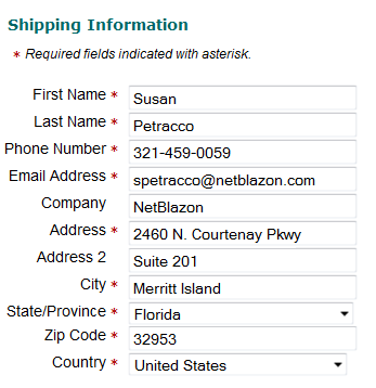
Ask for as Much Information as You Need…
…but not a single
field more. A customer’s sense of dread increases dramatically with every field
you add to a form on a page. For some, it’s just a matter of the time it takes
to type in all their information; for others, their worry about identity theft and
fraud grows with each piece of information they need to provide. Even if your
shopping cart software has a default field, you likely don’t need to use it.
For example, if you don’t use a customer’s fax number for anything, why ask for
it? Most e-commerce communications are handled by email and phone, not fax, so
many companies can omit this field. If you only ship within your own country,
don’t ask customers to choose a country. Simply put a small statement at the
bottom that reminds people of your policy, instead of a dropdown with a single
country in it. (Or even worse, a dropdown filled with countries that generate
an error when the form is submitted!)
Provide “Breadcrumbs”
Many shopping carts
don’t provide a single Magento checkout page, and the jury is still out on whether they
are more user-friendly than checkout processes that span multiple pages. If
your checkout process includes more than one page, make it simpler by reminding
your customer where they are in the overall process with a clear graphic. Think
of it as the sign near the entrance to your local shopping mall with the “You
are Here” pointer, except it’s a map for your website. As an added bonus, you
can also reinforce the concept of security with your choice of words and
graphics in the image.
Scrub Addresses
Scrubbing addresses is
becoming more widespread on e-commerce sites. The idea is that there’s a layer
of technology on the back-end that takes the addresses (especially the shipping
address) and compares it against a known set of addresses, such as the US Postal
Service address database, and returns a scrubbed address – one that has been
verified as a real address, and formatted according to carrier preferences.
This concept has a
number of benefits. First, it can reduce address-correction fees with your shipping
carriers (UPS, FedEx, and the postal service). Second, it can reduce costs
associated with returned packages due to undeliverable addresses. Third, it can
improve the accuracy of sales tax calculations in destination-based tax states.
The USPS provides this service, but under very limited circumstances (for
example, you must be an active USPS shipper). Our own AccurateTax service offers address
scrubbing as a stand-alone service or as part of our sales tax solutions. And
there are other options for various carts.
Required and Optional Fields
A corollary to the
above rule: don’t make a field required unless it needs to be. Visually, the
customer address forms need to have an indicator that shows which fields are
required and which ones are optional, and they need to align well vertically.
The most common indicator is an asterisk. However, if every field is required,
don’t put an asterisk by each one. A single statement at the top that says “All
fields are required” will suffice and clear some of the visual clutter – and
customer confusion over why every field has the asterisk.
Use Trust Marks
Recognized trust marks
are a simple way to remind customers of the protection you place on their
personal information and payment details. Trust marks come in a variety of
forms. The simplest one to include, that usually doesn’t add any additional
cost to your overhead, is the security badge offered as part of your SSL
certificate. All of the major SSL certificate providers offer such badges –
you’ve likely seen Verisign, GeoTrust, Thawte, and other security badges on
major e-commerce sites.
A second form of trust
marks includes those from companies that scan your site for security holes and
PCI violations. These became well-known several years ago when the HackerSafe
logo become prominent, and MarketingSherpa reported
amazing increases in conversion rates for PetCo when displaying the logo in the
site’s header. Today, HackerSafe has become McafeeSecure and is still a leader in
this type of service. While the McafeeSecure logo can still be seen on many
e-commerce sites, they’ve been joined by a number of competitors, including ControlScan and Shopper Safe.
On checkout pages,
particularly the page where customers enter their credit card details, it’s
especially important to show it high on the page. On our redesign, we grouped the
trust marks into a bar along with the customer service phone number and
provided it near the top of every page in the checkout process for consistency.
We’ll be exploring
other trust marks in an upcoming article.
Provide a Printable Receipt
A printable invoice or
receipt is necessary because a) emails don’t always reach their destination,
and b) customers don’t always remember their orders. Offering customers the
ability to print a black-and-white, bare bones receipt once their order is complete
allows them to get hard copy proof that they did indeed order X, Y, and Z from
you. It also helps them find discrepancies and call to have them corrected
earlier in the process.
Use the Receipt Page for Merchandising and Engagement
The receipt page is an
often-overlooked place to ask the customer for additional sales, feedback, and
participation. Here are a few ideas to include on your receipt page:
- Link to your Facebook page
- Link to your Twitter account
- A form to sign up for your
email newsletter or paper catalog
- The chance to add a popular
accessory to their order
- An offer to upgrade their shipping for a special price
Indicate Processing and Shipping Times
Customers want to know
when they will receive their order. In most cases, this depends on two factors:
- Processing time: how long it
takes your warehouse to pack the order for shipment, and
- Shipping time: how long it
takes the package to reach the destination.
Explain both to the
customer as early as possible in the checkout process, and repeat the
information as needed and in the confirmation email.
Send an Automatic Receipt by Email
You should
automatically send a receipt by email immediately after the order is placed.
Some customers won’t use the printable receipt, but will expect the emailed
receipt to arrive in their inbox within a minute or two of the order being
completed. The email should provide a copy of the billing and shipping
addresses, the cart contents (including any discounts, tax, and shipping
charges), and a phone number to call in case of errors. If you can’t send out
an email immediately, state the expected delay time boldly somewhere on your
web-based receipt page.
Không có nhận xét nào:
Đăng nhận xét